
Clarify options within cart product unit
During user research on the product details page, our team discovered that many users didn’t realize product options were already shown in the cart title. This caused them to go back to the product details page just to double-check.
I worked on improving the cart page so that users could easily confirm their selected options without leaving the page. This helped create a smoother checkout experience and reduced unnecessary navigation. We successfully turned a small but important user insight into a meaningful feature.
Identifying Issues through User Research
I identified a gap in user understanding through research insights and proposed a cart page improvement that reduced unnecessary navigation.
Insight-driven Design Improvement
I translated a usability issue into a design enhancement by making option information more accessible directly within the cart.
Year
2024
Duration
1 month
Team
1 Designer
1 PM
4 Engineers
Company
Coupang
background
What is Coupang?
Coupang is South Korea’s leading e-commerce platform, often called the “Amazon of Korea.”
It offers a wide range of products including groceries, electronics, and daily essentials.
Known for its “Rocket Delivery” service, Coupang provides fast, next-day or same-day delivery through its own logistics network.
CONTEXT
Recognizing the Problem
In our 2024 cart-related test, we noticed many users unexpectedly returning
to the product details page to finalize their purchases, despite already having items in their cart.
We weren’t immediately able to pinpoint why this behavior was happening.

OBSERVATION
Why Do Customers Enter Product Details Page form the Cart?
01
View Product Images
Users returned to the Product Details Page to see larger or alternative product images beyond those displayed in the cart.

02
Check Options
Users revisited the Product Details Page to confirm their selected options or to explore other available options.

03
Compare Details
When considering multiple products, users navigated back to the Product Details Page to review detailed information again.

PROBLEM STATEMENT
Root Cause
Customers often struggle to verify product options within the cart, causing them to revisit
the product details page to double-check items before proceeding to checkout.
Currently, product options are displayed at the end of each item's title, but they're not sufficiently prominent for customers to notice easily.
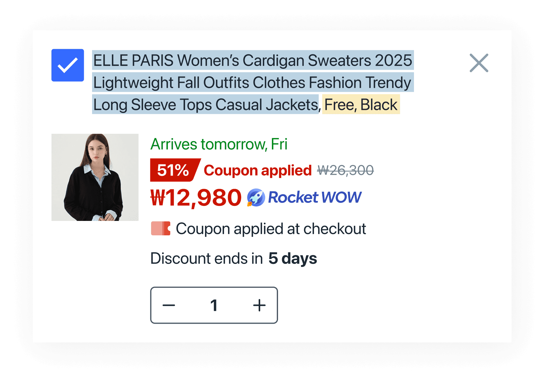
Product Name
Options
Hypothesis
Users may not recognize the product options in the cart
UT Method
We showed a cart page with a list of 3 products
We asked what the option for the top-listed Cardigan was
User Feedback
“The cardigan in the photo was black. But the price catches my eyes more.”
“The product name was long, but I don’t remember the details.”
“There was an option? I didn’t notice because the product name was too long.”
Result
Customers have difficulty identifying the options within the product title
BENCHMARK
How Other Services Display Product Options
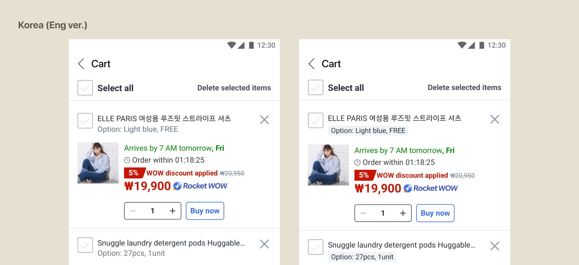
To address this issue, we explored how leading domestic and global e-commerce services handle product options within their cart page. We found that most services display product options in a separate row within each product unit on the cart page.

HYPOTHESIS
Highlighting product options in the cart will significantly boost GMV and orders
by helping customers quickly verify their selections
DRAFT
Variants

TEST
A/B test conducted
in Korea and Taiwan
Coupang entered Taiwan for its strong e-commerce potential and demand for fast delivery.
Taiwan also serves as a testbed for Coupang’s broader expansion in Asia.
To optimize user experience and understand local preferences, A/B testing is actively conducted there.


IMPACT
Results of the A/B test
The test showed no negative impact on guardrail metrics and delivered successful results, ultimately receiving final launch approval from the launch committee, with TOBE B ultimately winning.
Daily orders
6K
GMV
500M