

Shopping Home Renewal
This project began as part of a navigation revamp within the Naver app. To better align with the rapidly evolving e-commerce landscape and reduce reliance on ad-centric content, we set out to deliver a more optimized, app-like shopping experience. As part of this strategy, the Naver Shopping Home was moved to a more prominent position within the app. I led the redesign of this newly elevated Shopping Home.
Cross-team Alignment
As this was a design-driven project, one of my key responsibilities was aligning perspectives across over 20 vertical business units, as well as planning and development teams.
Balancing Competing Priorities
Many vertical teams wanted their own benefits and promotions to be prioritized and prominently featured at the top of the page. Since it wasn't feasible to accommodate all requests, I created multiple design proposals based on user research and data to guide decision-making and build alignment.
Effective Stakeholder Communication
Balancing diverse business needs was challenging, but consistent communication with stakeholders led to alignment and ultimately a successful launch with strong results.
YEAR
2023
DURATION
2 years
TEAM
1 Designer
1 PM
4 Engineers
COMPANY
Naver
BACKGROUND
What is Naver?
Naver is South Korea's largest internet platform, and its mobile app is the most widely used gateway for integrated search and content. The customers can access a wide range of services-including news, blogs, communities, shopping, and payments-all within a single app.
CONTEXT
Structural limitations of Naver Shopping
Unlike standalone e-commerce apps, Naver Shopping is embedded within the Naver app. This structural limitation prevented its home screen from functioning as a primary entry point for shopping, resulting in lower visibility and strategic significance.

The Need for Shopping Home Renewal
With the Naver app’s navigation update, access to the Shopping Home significantly improved, opening up an opportunity to deliver an experience closer to that of a standalone shopping app. To reduce operational overhead, the team opted to mirror the existing Shopping Home rather than develop a separate version — a decision that initiated the renewal project.

PROBLEM SUMMARY
01
Low Content Engagement
02
Low Traffic to Vertical Pages
03
Low Click-through on Top Ad Banners
PROBLEM
01
Low Content Engagement
The customers cared more about shopping info than the content
Unlike standalone e-commerce apps, Naver Shopping is embedded within the Naver app. This structural limitation prevented its home screen from functioning as a primary entry point for shopping, resulting in lower visibility and strategic significance.

1
Hamburger menu
42.8%
/
2
Cart
15.7%
/
3
Hero banner
2.4%
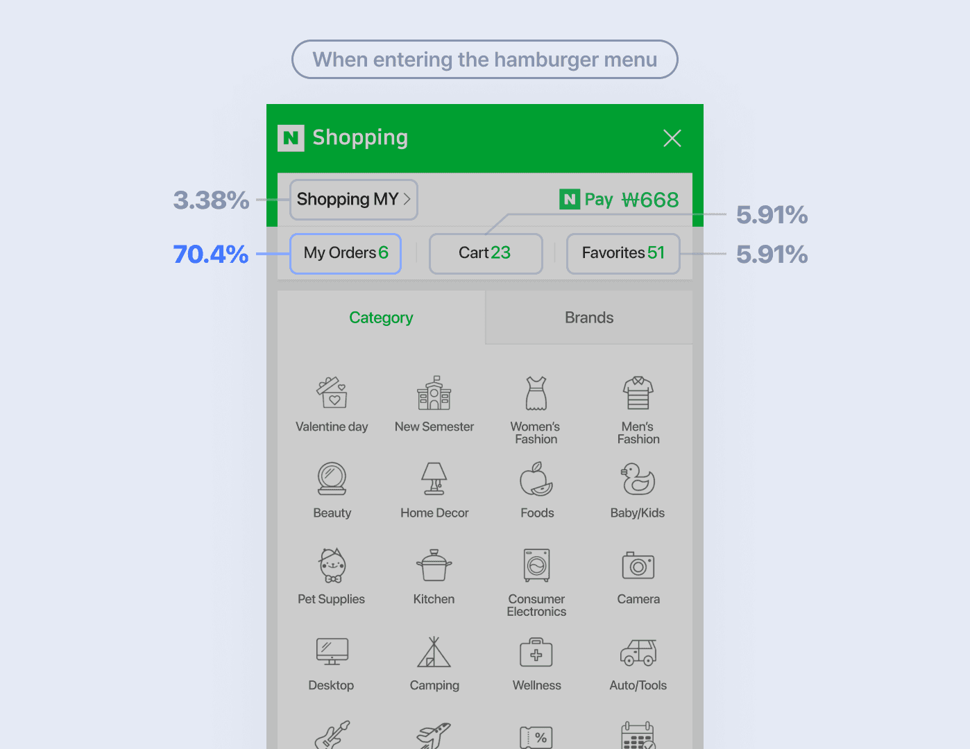
1
My orders
70.4%
/
2
Cart
5.91%
/
3
Favorites
5.91%
Basic recommendation logic based only on age and gender
The average CTR was just 0.7%. Simple recommendations based on age and gender showed below-average CTR. (It girl: Women under 20s / Women: Women 30+ / Men: Men of all ages) But modules using personal data performed significantly better.

02
Low Traffic to Vertical Pages
Poor visibility and Unclear Entry Points
Verticals were accessible via the LNB, but user attention was drawn away by the large hero banner and GNB. Unclear labels and generic landing buttons further discouraged engagement.


03
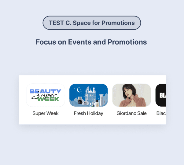
Low Click-through on Top Ad Banners
Low visual impact due to generic imagery
The top banner lacked high-impact visuals, as it had to accommodate a wide range of products and brands. As a result, its image quality fell short compared to the refined, brand-focused visuals seen on other commerce platforms.

Brand
Day

Brand
Day
A Pick for My Love
Pet Doctor UP TO 50%↓

Na
Black


Brand
Day
Grab Mega Savings
Switch-On Hot Promotions

B
Just

Brand
Day
Ready for Kids' Day
Sale ends tonight!
What
Choo
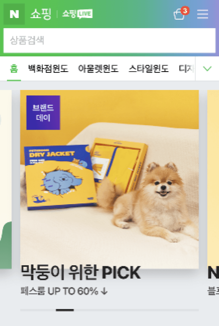
Top banner ad on Naver Shopping


Ad banner on other commerce platforms
Hypothesis
01
Personalized
Recommendations
Personalized content drives more
product purchases.
02
Entry Point to
The Vertical Page
Exposing vertical paths boosts
vertical pages traffic.
03
Highlighting
Shopping Info
Highlighting ‘My Info’ at the top improves
engagement in Shopping Home.
solution
01
Personalized Recommendations
Recommended content tailored to each user’s shopping context.
Real-time, personalized, and ranked suggestions are provided based on shopping history.
The personalization engine extracts categories and keywords to surface highly relevant items and encourage further browsing.

Product Listings in a 3x2
Showing the same number of items in a 2x2 grid with a 'Next' button performed better than a swipe carousel. While the 'Next' button is also an interaction, it has a lower barrier than swiping, making browsing easier and improving product visibility.
Type
UV
In-page click ratio
Carousel
74
3.3%
2X2 Grid
1,729
4.8%
1.5%

02
Adding Vertical Page Paths
Customized Vertical Modules to Reflect Unique Business Characteristics
Based on feedback from over 20 vertical teams,
we avoided applying a uniform layout. Instead, we designed each module to highlight the specific strengths of each vertical, resulting in higher relevance and improved user interaction.

Shortcut icons to showcase verticals' branding
Previously hidden in expandable menus, verticals were surfaced via a swipeable UI. Favicons and product images enhanced visibility and clickability.We analyzed external commerce apps and identified 3 common shortcut types.

It may hinder the opportunity to
explore other verticals

Displaying both key verticals (official brands) and categories (Individual Entrepreneurs) simultaneously
In the current structure, it’s difficult to explore other pages after landing on the promotion page
03
Exposing Shopping Information at the Top
Added a Personalized Shopping Overview Module
We replaced the low-performing top AD banner with a personalized shopping overview module that highlights the information customers most frequently seek.

04
Responsive Design
Responsive PC Layout with Modular Design
We adopted a modular approach to ensure the layout remained natural and consistent across various screen sizes. At the base resolution, modules are arranged in two columns.
For screens wider than 1365px, an additional column is added to better utilize the available space and display more content at once. This modular system allowed us to adapt flexibly to increasingly diverse PC environments.

impact
Project Results
We achieved 2 out of 3 goals. While overall performance improved,
further iteration is needed to optimize effectiveness.
X3.8
Daily GMV
300M
250M
200M
150M
100M
50M
1M
Before
After
8M
300M
900,000
700,000
500,000
300,000
100,000
550K
670K
5 Days Before Release
Released
5 Days After Release
770K
+40%
UV(Unique Visitors)
40%
Average Daily Clicks
1.15M
Page position
Top
Middle
Lower
50K
510K
690K
Next Steps
The vertical modules demonstrate a low click-through rate relative to impressions.
Further validation is needed based on new hypotheses, such as incorporating personalized data and dynamically adjusting module order per user.
170
Clicks per Content
Unlike the recommendation module,
vertical modules focused on promotions and
events rather than personalized content,
resulting in lower overall performance.
Most Clicked Element
"Next" button had the highest clicks,
but did not lead to further content exploration.